Online presentation skills do not come naturally to every aspiring Udemy instructor. Yet your presentation skills can dramatically impact the quality and learning outcomes of your online course. Making a Udemy course is possibly one of the most complicated yet fulfilling profession. Think about it, how many times have you sat in a room listening to a presenter and found your mind wondering and yourself waiting for the talk to be over? How many bad YouTube videos have you skipped over looking for something better and more fun to watch? You don’t want your students to start feeling the same way halfway through one of your lessons or your course! Here we will give you some tips not just on how to create a Udemy course but on how to make it an engaging one!
We do live in the age of YouTube, live streaming and instant gratification. So, if your online presentation skills – and we mean both video and PowerPoint skills – are not in tiptop shape, you could lose student interest. They won’t finish your course or worse, will leave poor reviews and you’ll be leaving money on the table. Making a Udemy Course that’s poorly reviewed and with no students would just be a waste of both time and resources.
As you create a Udemy course, it’s worth investing a little time thinking about how you can make your online video presentation more engaging and consider more deeply what the options are for creating valuable PowerPoint slides. Searching how to create a Udemy course would also help!
Your Videos and PowerPoint slides would be your main medium of interaction with your students. It is essential that you get their whole undivided attention. At home, your students will have exponentially much more distractions than in a physical classroom so put that in mind when making a Udemy course.
Organizing Your Content into Video and Slides
While some instructors decide to create taking head-only videos and others may use screencasting only, for this article we assume that you will be doing more of a “mashup”, as Udemy refers to it, combining video and slide content. So as you are outlining your course and gathering up content, you should be deciding what topic information you will present on slides, and what you will simply address verbally on video. It would be for the best of both parties, both you and your students, if you create a Udemy course that is very dynamic. This will allow you to gain more students and the students learn while also being entertained.
For example, research results, such as statistics, is better shown in a display such as a chart or diagram, rather than verbally announcing numbers. However, if you want your students to just listen to a story very attentively without being distracted, then just tell the story in fullscreen video mode.
Whatever split between slides and video you decide upon, a student shouldn’t be staring at a single PowerPoint slide for more than 2-3 minutes. If you have more to say about a single visual, then you should split what you have to say into more slides.
Tip: You can accompany some of your PowerPoint slides with an audio narration instead of a video. For example, if your slide contains an infographic or a large diagram, you may not want to emphasize the presenter but rather have students focus on the image on the slide. So you can describe your visual using a voice-over instead.
5 Tips for PowerPoint Slides and 5 Tips for Videos
While the following online presentation tips might seem obvious, it is a different thing to keep track of them and put them into practice consistently for a several hours-long course. We’ve divided our 10 tips into 5 tips for PowerPoint slides and 5 tips for video presentation.
PowerPoint Presentations
1. Keep your text simple and efficient
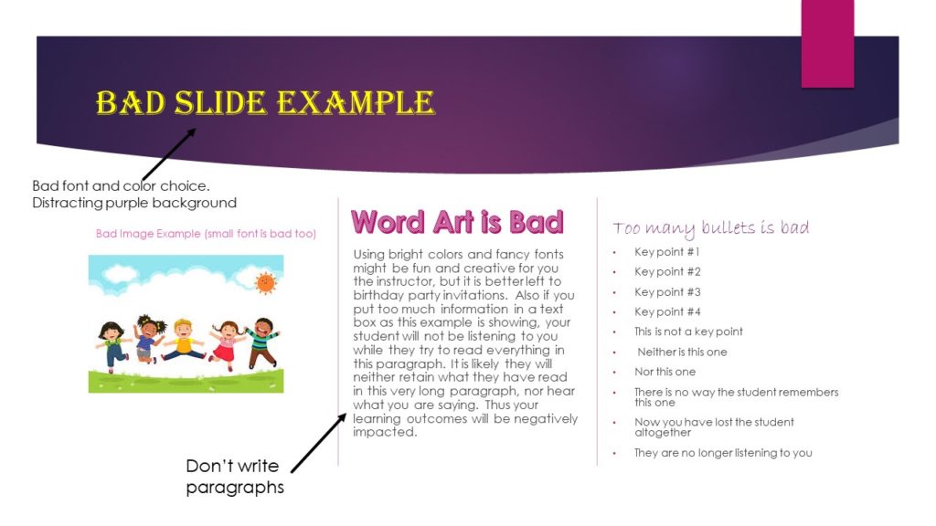
Slides are meant to help remind viewers of your key lesson points. Remember not to write paragraphs on your slides when you’re making a Udemy course! If you put too much information on a PowerPoint slide, viewers may get confused or be so busy reading the text they are not listening to you.
Create a Udemy Course that is easy to digest. Think of the PowerPoint slides as the online presentation of your talking points. This way, if a student wants to go back and review that section of your online course, they won’t necessarily have to listen to the entire lecture. They can simply review the key points as a reminder.
And while in the next point we talk about visuals , make sure that when you combine visuals and text together there is still plenty of “white space” left on the slide. The less clutter on your slide, the clearer your teaching message will be.
If you’re stuck for PowerPoint ideas, there are great resources online including this guide from Venngage which includes lots of actionable tips, as well as multiple PowerPoint presentation templates that you can choose from.
2. Incorporate visual examples
In our Beginner’s Guide we briefly touch on the importance of visuals in learning. A key strategy for successful online instructors is to appeal to all kinds of learners. Many people learn by seeing, as opposed to hearing, writing or reading. This is particularly true for the Youtube generation. Here are some simple do’s and don’ts when using visuals in an online presentation.
PowerPoint Visual Do’s when making a Udemy course
- Use 1, maximum 2 images per slide and make sure they represent “1000 words”
- Make sure the image is relevant to what you are saying/teaching
- Try to invoke emotion with your visuals – humor, wonder, confidence, etc.
- Use screenshots or recorded screencasting for explanation and demonstrations
- Include a very short video clip now and then to mix it up
- Provide image source and copywrite information
- Use charts, graphs and tables when appropriate. 1 per page is a good rule, 2 for comparative purposes.
- Use images of real people and things.
PowerPoint Visual Don’ts
- Use cutesy art and extra “décor” on the slide
- Make a collage
- Include a mix of media on one slide – video, image, animated gif, infographic, etc.
- Include a fuzzy or low DPI graphic
- Include a bunch of transition animations, i.e. fade ins, whoosh, bells, etc.
- Use cartoons or clip arts, except occasionally when a cartoon or meme may enhance dry subject matter or really drive a point home
A note on images: You can get high quality, copyright free images on Pixabay and Unsplash.
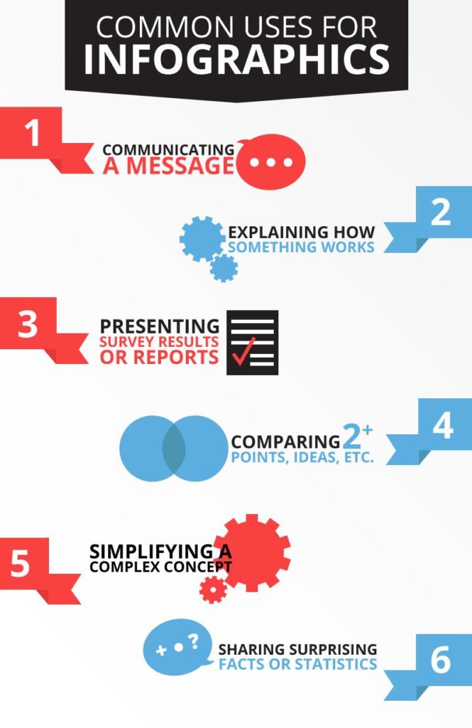
3. Consider creating a few infographics
Infographics are everywhere nowadays. So these merit special attention. They can not only be used in your online presentation slides but also as downloadable “freebies” which add to the value of your course. Plus, they force you to be really organized in your thoughts/ideas so that you can present information in a succinct, efficient manner. Plus they can be fun to make.
If you have particularly complex information to present, an infographic can be a great time saver for both you and your students. However, if the infographic is very complicated, it may make sense to present it in pieces. This article provides an explanation of how to do this.
There are a few added bonuses of creating infographics for your online course. Did you know that infographics can help to boost a website’s SEO traffic? You can put your infographics from your online presentation on your personal instructor website. Another bonus is that infographics are easily shareable on social media, a fact which makes them more shared than articles or presentations on platforms such as LinkedIn, Twitter and Facebook.
Not sure how to create an infographic? Don’t worry, there are plenty of resources and videos online to walk you through the process like this one.

4. Keep the design and layout elements simple
While you should have a consistent style and theme throughout your online presentation, avoid using PowerPoint templates because they just look canned and don’t represent your personal brand. Pick a design that resonates with you and your subject matter. For instance, bright colors or pink don’t reflect a male instructor teaching a Finance course. Create your own template for consistency.
Some key things to keep in mind to ensure a simple, effective layout are:
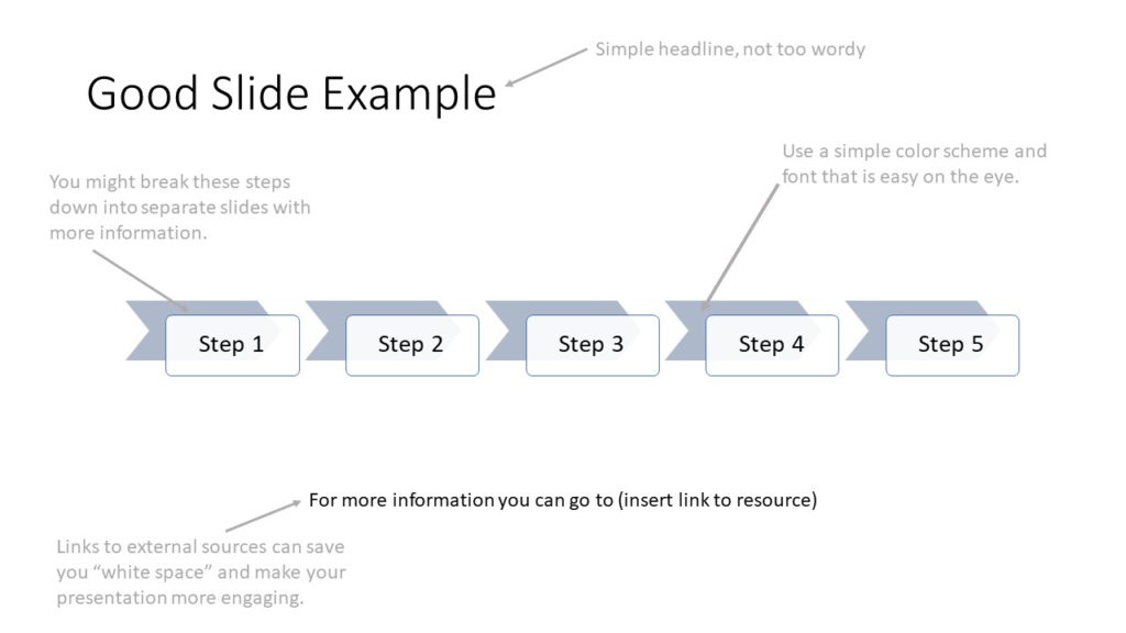
- A simple layout includes a header, 3-4 bullet points (or steps) and maybe an image or two.
- Use simple, clear fonts to reduce reader fatigue. Fonts often used for online presentations include Arial, Helvetica and Calibri.
- Avoid over use of colors and uncommon colors for the same reason.
- Use dark text on a light background rather than the reverse.
For kicks, we’ve created examples of good and bad slides below.


5. Use the slide sorter view
Online lessons should be broken into digestible chunks. People learn better when information is presented this way. So along with not overloading any single slide and not spending too much time on one slide, you also have to make sure that the “chunks” of information in your online presentation flow naturally and logically.
A cool trick to making sure that this is the case is to get out of slide view in PowerPoint and go through your presentation, narrating it for practice, in the slide sorter view. In this view you will get a better feel for how the audience will experience your course and discover if your “storytelling” in terms of delivering learning points is working. You’ll be able to pick up on any “noise” in the form of extraneous information or busy visuals, as well as “gaps” in detail, building blocks for learning, etc.
Slide sorter view is also helpful to create your script because you can see the “big picture” and use it to decide the best place to insert key learning points, stories, downloads, quizzes, etc.
Video Presentations
1. Infuse energy and modulate
When it comes to the talking head version of yourself, you need to think and behave outside of the PowerPoint presentation onscreen. This mindset is like a real-life presenter not relying on his slides to convey information and not reading off the slides. Don’t do that it’s boring! Remember for your students YOU are the teacher, not the slides. So, you are their focus no matter how cool and useful your visuals are.
Watch out for monotony. Especially if your course is 3 or more hours long. Even if your subject matter doesn’t lend itself to fun, you can use your own sense of humor and energy to infuse a sense of levity into what would normally be dry and dull material. For example, everyone loves an exciting story or a joke. Try to incorporate some entertainment while making a Udemy course.
Finally, some people have great success imagining that they are talking to a friend when they are teaching. Think about it, you’re relaxed and casual with a friend. It’s a 2-way conversation. Even though you can’t have a conversation with your students, presenting yourself in this way conveys a sense of openness and will likely encourage students to get in touch with you – which in turns can help your ratings, reviews and future sales.
2. Watch your body and verbal language
Even if you are doing just a talking head video (in some cases it may be almost full body), it is important to pay attention to small things that can affect how you come across on camera. You might have a habit of touching your face or wringing your hands while talking or looking away momentarily while you are finding your words. You may be a person who talks excessively with their hands or clears your throat a lot when you speak. Perhaps you just make awkward gestures from time to time. If you are a pacer when you are thinking don’t do this on video.

All of this is distracting to a student, especially over the course of a several hours of material, these body language quirks can get really tedious.
As for verbal language, many people have a habit of using a lot of verbal interjections such as “um”, “like”, “you know” and “uhh”. All of this is again, distracting and may make your students think that you are not confident in what you are teaching. Likewise muttering, taking deep breaths when you speak, or speaking too quickly is off putting and doesn’t come across as being a professional.
Finally, going back to the suggested conversational mode of online presenting, make sure to maintain eye contact with the camera as if you are speaking directly to the student at all times.
3. Make your background work for you
As with your slides, it’s best to keep the background of your video presentation as simple as possible. Avoid filming in parts of your house that have fancy lights, mirrors, patterned curtains, art and family photos, etc. It’s just too distracting (and not very professional)
That said, you can be purposeful with your background to help set the mood of your course. For example, if you are a yoga teacher, you may want to film in a peaceful setting such as your backyard or a yoga studio. If you are teaching a course on Finance, you may want to be sitting in a simple office setting with a stock chart in the background on the wall.
Finally, as part of your “background” consider carefully what you wear. The same rule of simplicity and relevance applies. So, a suit for a more serious Finance course may be a good idea. As for the yoga teacher, a simple elegant yoga outfit would make sense – but not a bright pink leotard.

4. Point out progress frequently
People are more motivated to learn and keep going when they feel they are making progress. Don’t forget to point out in both in your video and in your slides key learning milestones. Give enthusiastic words of encouragement and congratulations on a job well done.
5. Stay focused
Scripting may not be your thing or may feel a bit stale when presenting. So some of the best online presenters suggest writing out key talking points and then improvising somewhat around them. That said, resist the temptation to go on and on about a point or to repeat yourself for emphasis. If you are telling a story or providing an anecdote, keep it short and to the point.
One More Tip
Wondering how to combine your PowerPoint slides and video to create your online course presentation? As one last tip, here is a link to a step by step tutorial on how to record an online presentation with slides and video using Camtasia, one of the most popular video editing software suites that Udemy instructors use.
Remember, a well-delivered online presentation is at the core of a successful Udemy course. But often, it is the last thing an instructor plans and practices when making a Udemy Course. Don’t make that mistake. A well-delivered online course presentation will deliver confidence and enhance your reputation as an instructor!


2 Comments
Pingback: Become a Udemy Instructor – 10 Steps - Blog | TeachinGuide
Pingback: Learning Styles and Udemy Course Design - Blog | TeachinGuide